Economic Charts

All economic charts are at the bottom of the page.

Saturday, September 4, 2010

Bank Failures Year to Date

More banks went under this week.  This brings the total number of banks that has failed year to date to 118.  If this trend continues we could beat 2009's bank failures of 140 by 28 more banks or a total of 168.


Note:  This is a corrected copy, my initial graph had numbers much higher due to data from the FDIC including all banks from 2000 (which actually didn't reflect all bank losses).  Parsing of data is now for 2010 only based on the closing date presented on the FDIC's online data and proofed against known data.

A Little Reality During Recent Recovery Hype

It seems lately a lot of hype is coming out about the double dip being averted.  This could become a self fulfilling prophecy as more and more businesses and people are starting to believe it.  Don't get me wrong, I would love to see a recovery (a real recovery).  The problem is that we would simply be delaying the debt bubble and we don't know how much time this would buy us (could be 6 months, 1 or 2 years).  The debt doesn't just go away.  Putting the hype and possible double dip aversion aside the reality of it, when you look at the data, shows that the economy is not healthy.  The two numbers that were rallied upon and were supposed to be a positive sign were the ISM and Unemployment.  Lets get real on this one, the ISM wasn't good,  I did an analysis on this earlier (here) and it showed manufacturers were ramping up for demand that simply wasn't there.  The unemployment number went up, so what are we celebrating about there?  Sure nonfarm payrolls looked better (after the government revised the numbers for June and July for some reason), but it was a sideways number (here) that indicated for 2 months we lost 54k jobs in nonfarm.  Charts have been updated at the bottom of the blog for you to assess for yourself.  Here is a video of Nouriel Roubini's outlook on the economy to help put some reality into the hype.

Friday, September 3, 2010

ISM Non-Manufacturing NMI Analysis

Well there isn't much positive in this report.  The ISM Non-Manufacturing index is a measures the level of a diffusion index based on surveying purchasing managers, excluding the manufacturing industry.  This like the ISM Manufacturing PMI Index is subjective and queries for the following five main categories: Business Activity, New orders, Employment, Supplier Deliveries and Investment.  There are other categories that are queried and I summarize later.  The report provided on August 2010 for the prior month showed a negative direction in all categories.  As shown in the graph below all five of the categories declined.
Another disturbing trend which is consistent with my previous ISM Manufacturing PMI analysis showed that prices for materials higher (woe, aren't we in a deflationary period?) and new export orders and the backlog declined.  Another similarity is that imports for materials was higher than exports.  This does not help GDP.  With these declining fundamentals, you really have to ask yourself what is going on here.

Unemployment Report

Wow, what a crazy day in the market. The Unemployment rate increased from 9.5% in the prior month to 9.6% in August.  The number was in-line with forecast, therefore the market rallied approx +127 points on the Dow.  If we look into the BLS report, we see that the labor force expanded this month by 550k and the number of unemployed expanded as well (we haven't seen a number this high since May's report).  The expanding labor force dilutes the unemployment number or the number of unemployed persons.  We also see an increase of 4% from the previous month in the number of part time workers due to economic reasons.  The unemployment rate of 9.6% is a break in the last 3 months trend of moving sideways at 9.5% and will need to be monitored (but does not seem like a good indication in the least).  The market almost seem disjointed from reality these days.
Perhaps it was the Non-Farm payrolls report which was forecasted to be -101k and came in at -54K (same number as previous month).  Yes this is better news (no increase that is), but I will need to see the revision that gets done on the number later or if numbers were pushed into next month for this one to stand out.  Another interesting note was the nonfarm payroll revisions that came in for Jun and July which brought the numbers down making the overall numbers look better.  Private sector added 67k jobs, which is down from the previous months adds and reflects after the revision.  Indeed it seems with a bad unemployment rate and a sideways Non-Farm number someone thought this was worth a rally in the market, but fundamentals remain weak.  I'll stick with the fundamentals, until they start moving in a more positive (improving) direction.  

Thursday, September 2, 2010

Peter Schiff on the Economy

Initial Unemployment Claims

Initial claims for the week prior to September 2nd 2010 looked slightly better losing 4k less jobs than the forecasted number of 476k, coming in at 472k.  The prior week number was 478K showing a slight improvement in persons filing for unemployment.   Remember nothing in the market moves in a straight line, so we will have to watch the numbers going forward to see a real trend develop.
Small business owners remain uncertain about the economy and have been reluctant to hire or invest in new equipment.  The subject of debt looms over small business owners as they struggle to stay a float in the current economy.

U.S. Auto Sales Hit a Deep Ditch

Multiple reports are coming out discussing how auto sales have hit a slump.  Per the Washington Post today reported that Industry Trends stated this is the worst monthly sales number in 28 years.  This is the result of pulling stimulus in an industry that needs false money injected to sustain itself.  In another report I viewed yesterday on the German auto sales, they too had a cash for clunkers equivalent that is now in a slump after the removal.  The manufacturers in Germany are now heading back to the levels they were prior to stimulus and it is reported the buyers of those cars are now feeling buyers remorse (due to getting rid of a paid off car and taking on debt for a new one).  [ Read more ... ]

Analyzing the ISM

The ISM Report is a subjective number obtained by surveying 400 manufacturers asking them to rate the level of business conditions.  The ISM Report contains the PMI (Purchasing Managers Index) which has 5 sub indicators.

  1. Production Level
  2. New Customer Orders
  3. Supplier Deliveries
  4. Inventories
  5. Employment Level
ISM is an indicator of economic health, an indicator of over 42, over a period of time indicates an expansion in the overall economy.  August 2010's number was forecast to come in at 53.2, but the actual number was 56.3.  This was a great number and the market responded.  Diving into the report, the industries that did the best related to more seasonal activities (Primary Metals, Apparel, Leather & Allied, Transportation Equipment, Fabricated Metal, Electrical Equipment, Appliances & Components, Misc, Computers & Electronic, Paper products, Chemical, Food, Beverage & Tobacco products, Printing and & Related activities.  Some of these items relate heavily to the back to school season, others are generally good and could be related to future concerns.  Industries reporting contraction were; Furniture & related, Petroleum & Coal, Nonmetallic Mineral, Plastics & rubber and Machinery.  Some of these contractions can be related to the consumer saving more than spending on items that are not mandatory to have.  Lets break down those numbers and see what is going on.
If we look at the trend over the past year we see that recent activity has New Orders declining (actually continuing a decline), as well supplier delivers in a slowing direction, Production is up and employment in reported as up (as can be seen in the trend line), as well as inventories are up.  

A few things to point out.  New Orders are slowing, so why the increase in production, employment and inventories?  Prices were reported higher for the 3rd consecutive month (actually was a pretty large jump in August from 57.5% to 61.5%) and 35% of respondents reported having to pay higher prices (53% reported the same prices and 12% reported lower prices).  Order backlogs also decreased for a 3rd consecutive month.  New Export orders declined for the month of August as Imports of materials by manufactures increased.  

Now that data does not exactly spell out a success story.  If New orders along with Export orders actually slowed and the backlog (pipeline) is slowing as well (showing a slowing in demand) how does this increase production and employment.  The report goes on to say that the annualized PMI of 56.3 percent corresponds to a 4.8 percent increase in real GDP annually, when we just had GDP revised downward. Also, if your imports are rising and your exports are declining, how does this improve GDP as the exact scenario resulted in the recent downward revision of GDP?  Another question is that a PMI of great than 42 represents an expanding economy, well we have been over 42 for a year (as shown in the graph above) so where's the party?  Last time I looked Unemployment was looking bleaker and bleaker.  Try to keep these reports in perspective.  It will be interesting to see what the market does today after the big run up. 

Wednesday, September 1, 2010

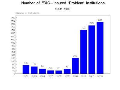
829 Banks on the FDIC Problem List

Over the past few days, news has been spreading about the number of banks that are now on the FDIC's problem list.  The number has been increased to 829 at the end of June from 775 in the first 3 months of 2010 (the Wall Street Journal reports).  CNN points out that this is nearly double the number of banks on the FDIC's watch list from last years 416.  Banks that end up on this list are considered the most likely to fail.  For a complete list of failed banks click here.  For the geography of failed banks click here.  [ Read more ... ]
Chart courtesy of problemlist.com

Though the FDIC does not publish its problem list for fear of a run on the bank, calculatedriskblog.com posts and unofficial problem list, click here to see if your bank is on the list.

It makes you wonder, in times where large numbers of small banks are failing and no real lending is taking place, how are the big banks are experiencing soaring profits?  Where is that money coming from, if lending is not taking place?  Is it making big bets on shaky investment with cheap money due to a loose fiscal policy?  Will there be fallout from that where taxpayers will have to step in again?  Who is really benefiting from this loose money policy, most Americans are underwater and cannot refinance (few above water can refinance, but they are not the majority).  Another point to made the other day, with big banks starting to lend, they are finding nobody wants the debt, furthering the argument on who is really benefiting, if nobody wants the debt?  [ Read more... ]

Tuesday, August 31, 2010

Chris Whalen's Memo to Obama

There are growing signs of unease bordering on desperation inside the Obama White House. Most of the O Team now understands that the real, private economy never got out of Dip Number One. The prospect of a permanent downward shift in “trend growth” to a lower track, and continued double digit unemployment, are driving a search for alternative measures that has even touched conservatives in the worlds of finance and economics.  [ Read more ... ]

Truth in the Economy

When a public official gives you a rosey economic picture and they don't back it up using all the numbers, you should be skeptical.  Gerri Willis does this, I like how she puts unemployment into perspective.  I also like the discussion on GDP, but she misses some issues in the prior GDP numbers that I covered in a prior post entitled "Is GDP a Good Indicator when the Government Intervenes?".

Understanding the Credit Crisis

Even though we have moved into a debt crisis, I thought this video on understanding the credit crisis would be pretty educational for people.  Enjoy.


The Crisis of Credit Visualized from Jonathan Jarvis on Vimeo.

Schools Borrow for Funding

This is a disturbing trend, school districts now have to borrow money to make up for their budget gaps.  Now school districts borrowing money (like small businesses) to make monthly payrolls is nothing new, but borrowing for the year to make up for budget gaps is.  The question arises, with the budgets getting increasingly cut each year (with no real end in sight) how do they pay these loans back?  Another issue  money.cnn.com brings up is that property taxes cannot be raised to fill the gap (and who can afford that in a declining economy anyhow?).  This will contribute to the already bleeding economy's list of debt woes as school districts get deeper and deeper in debt by refinancing (rolling over) the loans they cannot pay every year.  We have already seen how one financial institution scammed a Denver school district out of millions.  CNN Money's article is specific to Alabama and outlines how the reduction in tourism revenues, due to the BP spill, has crippled them.  What is BP's responsibility in this?  Are we going to hold them accountable for ripple effects of the damage they caused?  [ Read more ... ]

Monday, August 30, 2010

Fixing the Financial System?

This interview with Christopher Whalen, from July 10th,  still applies today.   As a matter a fact I think it is more true today than it was in July.  With each economic report coming out we see that the withdrawal/slowdown of stimulus is hurting the economy.  Like a drug addict has to have its fix to feel normal, the economy needs its fix of stimulus and credit expansion to feel normal as well.

Personal Spending & Personal Income

Personal Spending is based on the change in total value of inflation-adjusted expenditures by consumers.  It is viewed as an important gauge of economic health as it represents a majority of overall economic activity. The prior number was 0%, the forecast for this past month is 0.4% and the actual number came in at 0.4%.  Personal Income was up from its prior number of 0% to 0.2%, which was under forecasts of 0.3%.  Personal income has a correlation to personal spending as personal income increases consumers can spend more.

Sunday, August 29, 2010

Is GDP a Good Indicator When Government Intervenes?

I looked over various data points on the health of the economy to see how we are doing and if we are really in this recovery the main media talks about.  It is healthy to constantly ensure your thesis is correct and your not missing anything.  To that end, I looked at GDP once again.
As a rising GDP for 3 quarters generally signals economic health and we had 2 quarters of major growth (2009 Q4 2.9%, 2010 Q1 5.9%) and even though Q2 2010 wasn't higher than 5.9% experienced in Q4 of 2009, coming in around 3.0%, it was still a relatively healthy figure.  One could argue that he 5.9% was an anomaly.  Given this, I was willing to investigate further.  I analyzed the timeframes of when the stimulus of 2008 came in.  The economic stimulus act of 2008 was signed by President Bush on February 13th 2008 and was worth $152 billion.  The legislation provided tax rebates for low and middle income families, as well as incentives for business investment and to increase the limits imposed on mortgages eligible for purchase by Freddie Mac and Fannie Mae.  This money did not go into the economy immediately.  Most did not receive their government checks until well into summer/fall.  The amount per family depended on tax bracket and the amount received depended on if you owed money or not.  It was reported to have increased spending by 3.5%, but in the context of the stock market, the market was in a free-fall throughout 2008.

One could argue the stimulus was so ineffective against the headwinds of corruption in the investment community, ratings agencies and mortgage failures, that we had to introduce another bailout package in 2009.  Hence, President Obama signed the Economic Recovery and Reinvestment Act of 2009 worth a reported 787 Billion dollars, but increased to over 800billion after.  The act was signed February 17th and had near immediate effects.  This stimulus' aim was to promote consumer spending, promote investment and increase consumer spending.  If you are interested on what it was spent on see link here.  As you can see, things began to turn around in the market and in the economy.

If we overlay the same data for the dow (only quarterly) to the quarterly report of the GDP we get something interesting.  At the same time the Stimulus was introduced, GDP and the DOW did well.
You can see the correlation between the market and GDP.  Just as major stimulus was being introduced in 2009, the market flourished and so did GDP.   In 2010, with stimulus and support for it waning (along with a realization of the damage debt can do to an economy), GDP moves downward and the market sits stagnant.  The 2009 GDP report shows growth in the 3rd and 4th quarters largely coming from Corporations or Gross Private Domestic Investment.  Gross Private Domestic Investment are expenditures by firms for tools, machines, apartments, buildings and new factories (not that factories are being stood up in the US much) and a change in inventories.  The consumer increased a bit mainly from consumption of durable goods (mainly motor vehicles and parts/ recreational goods and vehicles, which incidentally was the same timeframe for cash for clunkers) and services.  

So what does this tell us, well it tells us that GDP growth in the 2nd half of 2009 was false, it was increased on false money (borrowed money by the American tax payer).  When the incentives slow or stop, so does GDP and growth (as we have seen stimulus slow and already spent from the consumer standpoint).  Two large takeaways are that GDP is no longer a good gauge of economic health, as long as taxpayer dollars are funding it and.  We would have to continue funding spending to ensure we can grow GDP.  That is not a recipe for a successful economy.  If QE2 comes to light again (and not that I am for it), then we need to invest more in becoming producers again (funding farmers to produced food for people not gas, energy grid improvements and factories to create the parts and bring back jobs that were outsourced overseas).   Unless we make changes from a mostly service society to a well balanced industrial and services society, I cannot see where growth will come from.